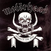
Here we have researched the different types of logos and symbols related around the genre of heavy metal in order to give us an idea for when we come to make and design our digi-packs. We mostly found that the area of heavy metal is shown through war, death and blood potraying to be dark and evil giving the impression to audiences what the music is like perphaps through this. We have also realised that it is potrayed through the use of cartoonish drawings in the pictures or fonts this could be done to show that it isnt realisitic or contributing to the fact for example the use of the red deviled man like creature on the left.
In conclusion this will help us to give a perspective in the type of fonts and logos we should display on our Digipack cover. We need to be able to relate to these so that audiences in this sector will know that we are a thrash metal band and it is a album.


No comments:
Post a Comment